What I did
UX strategy
Wireframes
Visual design
Video art direction
S&P Global 2017 Digital Annual Report
S&P Global is a company which offers market intelligence products like S&P 500 index. We partnered with them in 2016 to create their first annual report after their major re-branding. In 2017, we continued to partner with them to create an annual report microsite for internal and external audience that would tell a story of this exciting year. The goal was to reinforce the brand message, resonate with different types of audience, and help to recruit new talent.
Key Messaging
We sat down with the client and discussed some potential messaging for this year’s report. We wanted to highlight S&P Global’s strong brand positioning “Essential Intelligence”, and also feature some of the exciting events that brought the business forward this year.
Sitemap and User Journey
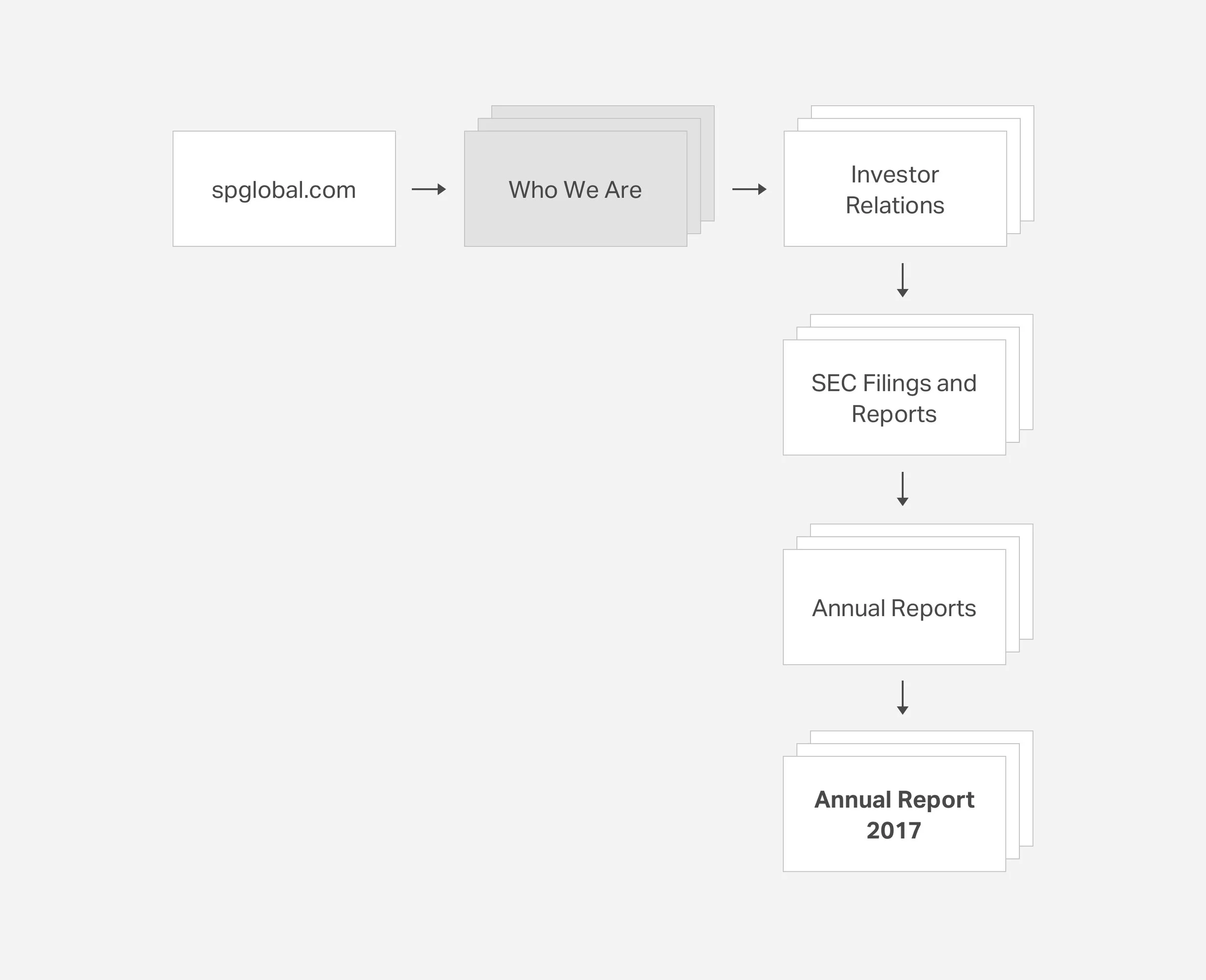
The digital annual report is a stand-alone, five-page microsite and will be listed on the Investor Relations section of S&P’s corporate site. We created a site map and also a user journey diagram coming from S&P Global’s corporate website to help us gain a better understanding of where the microsite would live and how the content would be laid out.
Wireframes
We then sketched out the pages in a high level way with strategic thinking of content clarity and hierarchy, power of messaging and usability in mind. The homepage will convey this year’s key messaging in an engaging way via scroll-activated full viewport experience, while other pages provide solid and clear structure for the robust content.
Mood Board
A mood board was put together to explore possible creative solutions that would work with the brand and messaging. Black and white minimalism photography, deconstructed typographic elements and red accent color were the key elements we explored.
Landing Page Prototypes
We explored different creative possibilities of the landing page experience by creating animated prototypes. Prototype 1 compares the power of data to the power of “pixels”, which might seem small on their own but will form great things when coming together in a meaningful way. Prototype 2 expresses the concept of “synchronization” through animations of sliced typographic elements.
Prototype 1
Prototype 2
Videos
The microsite features three pieces of original video content. A mood board was created for the video team to make sure that the art direction of those videos align with the microsite. Black and white photography, simple and clean graphics and bold typography are the key elements.
Final Product
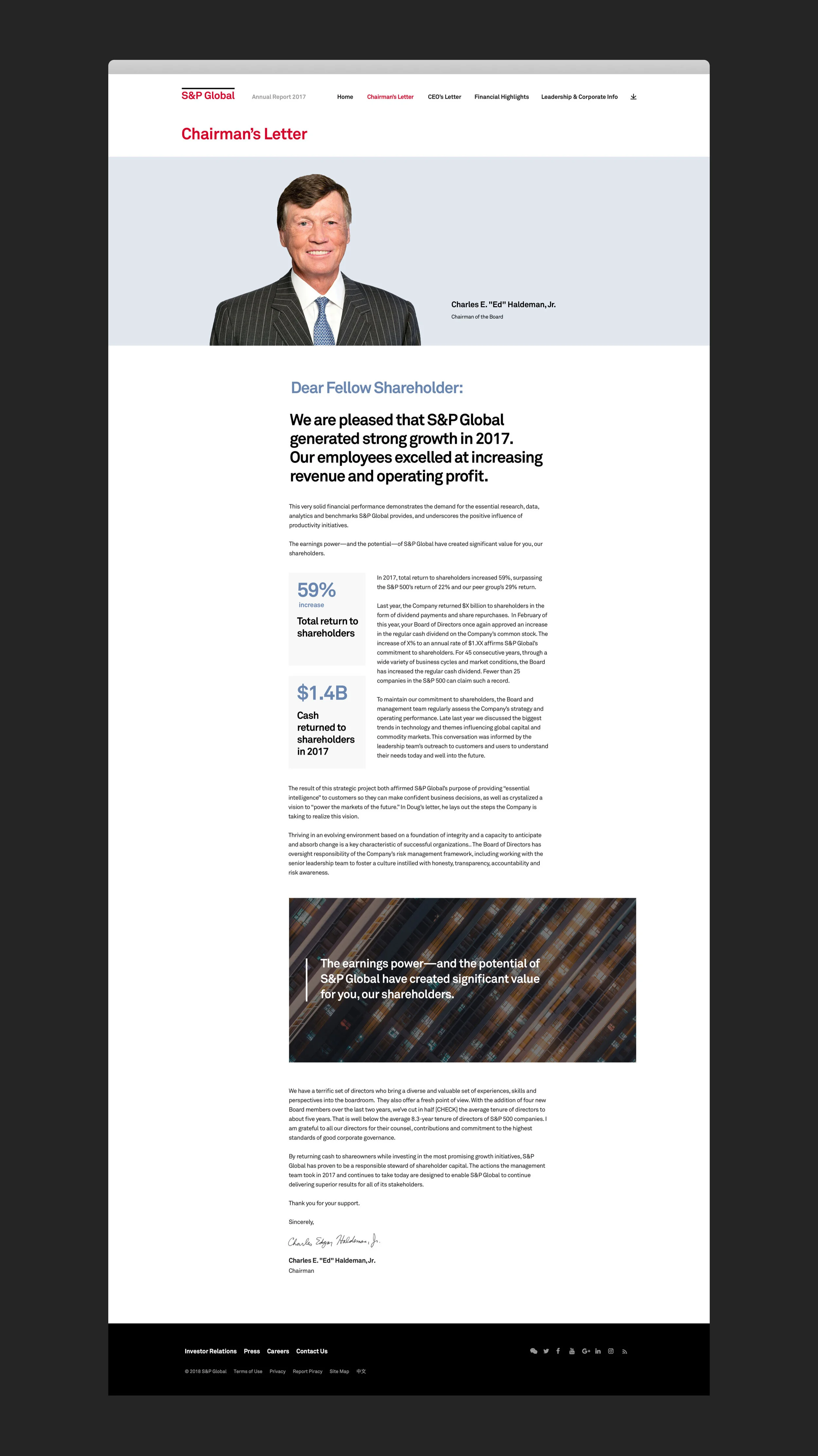
We delivered yet another great piece of digital experience for S&P Global’s online presence. The microsite features a five-panel full viewport landing page experience which expresses the theme in a metaphoric way. The interior pages follows S&P’s brand style and deliver the information in a clear way.
The CEO’s letter page is fairly long scroll due to the amount of content that lives on there, so we put a side nav which in corporates a progress bar to let the user jump between sections easily and to know where they are within each section.
The microsite was always optimized for different screen sizes, especially mobile devices.
Reflection
We were able to take a message and created a metaphoric yet compelling digital experience and the client was very happy with the result. The microsite was promoted internally through emails and externally through social media, and received positive responses from both sides.


