What I did
UX strategy
Wireframing
Visual design
Video art direction
S&P Global 2016 Digital Annual Report
S&P Global is a company which offers market intelligence products like S&P 500 index. In 2016, they changed their name from “McGraw Hill Financial” to “S&P Global”, and rebrand themselves to be a much more modern, forward-thinking and tech-savvy company. As the first annual report after the re-branding, the client wanted something that strictly follows brand guidelines, reinforces the brand message, and also tells a vivd story of this exciting year.
New brand and message
Since reinforcing the new brand is one of the biggest goals of the project, we started the process by analyzing the new brand guidelines thoroughly and trying to find elements that would inspire.
Essential Intelligence
The brand purpose of S&P Global is to "provide intelligence that is essential for companies, governments and individuals to make decisions with conviction". Their information and expertise are essential for a lot of people to do their jobs well. We thought for the first year of this new brand, it make sense to set "Essential" as theme for the annual report, because it summarizes what they do perfectly and positions the brand in a solid way.
Essential Objects
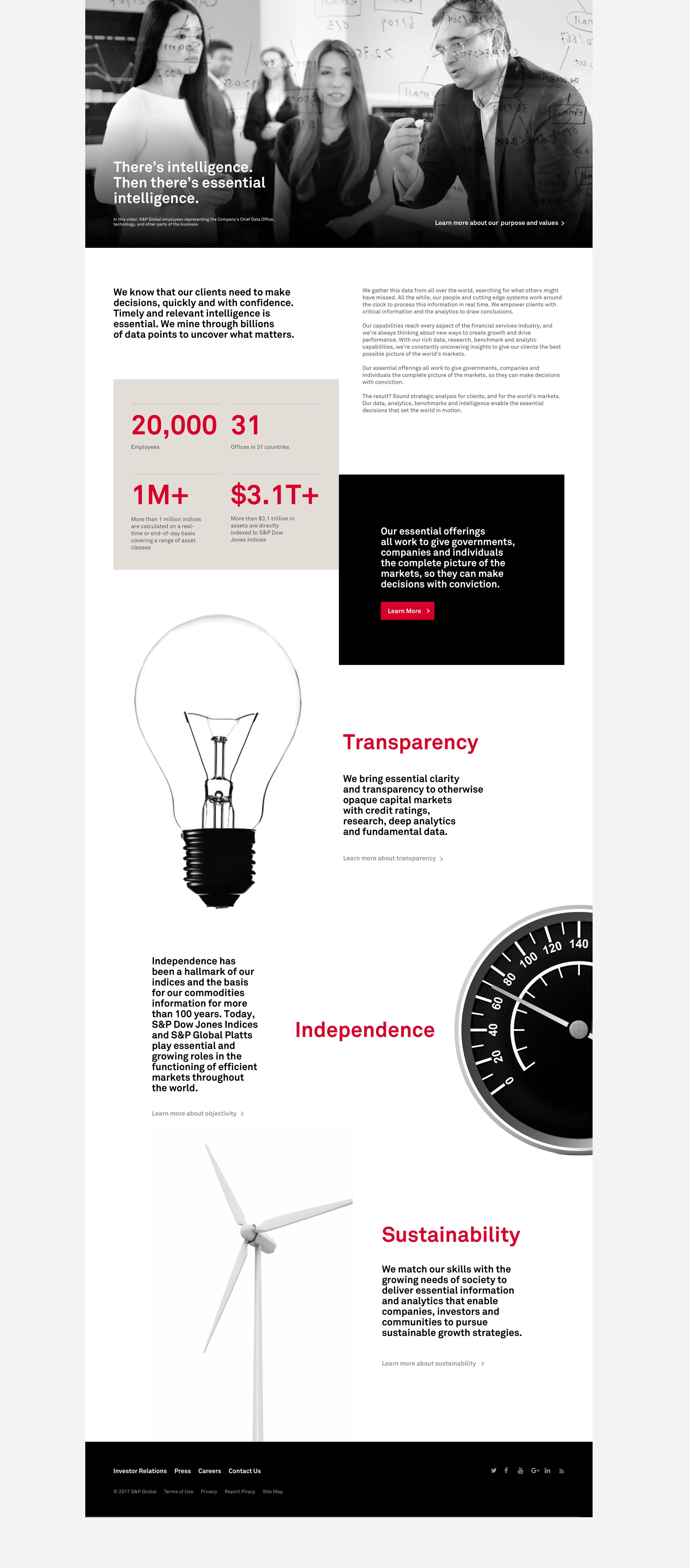
Inspired by a special photography style introduced as a part of S&P Global's new brand, we used straight-on black & white photography of objects that are "essential" to daily life and work, to create a look that emphasizes on the theme "Essential". These objects were photographed in a way without any unnecessary details, colors or distorted angels, only essence of the form remain.
Bold typography, numbers and facts
Typography is a big part of S&P Global's new brand. We leveraged the bold and clean style with a editorial approach. Data and facts are a part of what they do, so we used lots of big numbers and factoid cards to make a visual connection.
Userflow and wireframes
With strategic thinking of the content structure and hierarchy, and also the usability targeting unique audiences (primarily stakeholders and investors), we sketched out the page flow of this 5-page marketing website, then turned it into wireframes with higher fidelity.
Visual assets: animated gifs
We teamed up with our motion graphics designer to animate the essential objects using 3D models to give them a bit more energy and excitement.
Visual assets: photo and video shoots
We teamed up with a photographer and arranged a photo and video shoot with S&P Global's employee volunteers to create photography and ambient video assets for the website.
Final Product
A collection of nine "essential objects" are featured on the landing panel of homepage. Whether it's physical things we need to survive like water, food or energy , or abstract ideas that we can't live without in our daily life like time or data, they all come together and send out one message "essential".
The rest of the homepage features three main stories of the year on three different topics: data transparency, objectivity and sustainability. Each topic is represented by an “essential object” and the user can read the detailed story by clicking on the CTA below.
Interior pages of the microsite follows S&P’s brand guidelines and are presented in a clean, minimal and typographic style.
The microsite is also optimized for different screen sizes, especially mobile devices.
Reflection
We were very excited to be the a first part of S&P Global’s new brand, and made sure that our work will enhance the brand in an effective way. The client appreciated that we used “essential objects” as the main concept since that’s a part of the brand elements that were used less frequently than others, and they were extremely happy with the end product overall.
The microsite received an Honors award from The 2017 International ARC Awards for annual reports.


