What I did
Visual design
Art direction
Participation in UX strategy
Pretium Website + Branding
Pretium is an alternative investment manager, founded in 2012 by to capitalize on fundamental market disruptions, inefficiencies and structural changes within real estate and credit markets. They’ve reach out to us for a new brand identity and website in order to better serve their clients, stand out from their peers and recruit new talent.

Competitive Audit of Branding
We analyzed Pretium’s competitors for their overall brand impression. Most of the other brands sit on the more traditional and standard side of the spectrum. In order to stand out from their peers, a more progressive and premium approach to the brand could be something to consider.
Logo Exploration: The Genesis of Value
We conducted several interviews with key stakeholders including Pretium’s CEO and Communications Officer to talk about the direction of the new brand. We were told that in the Latin language, the word “Pretium” means “Value”. During the interviews, we’ve been hearing phrases like “The genesis of value” and “The evolution of opportunity”, which symbolizes Pretium’s business model: taking advantage of untapped opportunity to manifest value in new and exciting ways. The client wanted the logo to visually convey “the genesis of value”. We explored a couple different ways to do that and the final chosen one is a “starburst” logo in which tinted triangular pieces burst out from the center full-colored core. This logo represents the idea metaphorically and feels progressive and premium.
Visual Language System
The IKB
Out of the 18 competitor firms we surveyed, 72% of them use blue as a primary brand color. The client wanted to stay in the blue family to not feel too foreign from their competitors, but also different enough to stand out. When researching different shades of blue we were inspired by Yves Klein’s artwork in his special made “IKB” color (International Klein Blue) and picked a vibrant royal blue similar to that as the primary color to make Pretium “same but different” and feel progressive and premium at the same time.
Large Blue Anthropometry (ANT 105), Yves Klein, ca. 1960
Graphics and Layout System
We created a graphics and layout system based on the center shape of the logo which is a perfect square.
The square can be sliced into a 45 degree triangle and used as a “blue corner” graphic element to anchor any important content.
We also explored a layout system using two squares overlapping each other. This system can be used as a guide to create dynamic layout. The shapes can be filled with imagery or solid color depending on the need.
Clean Aesthetics, Monochromatic Photography
We wanted the vibrant blue color to be the focus of Pretium’s brand impression, so the general aesthetic of the brand is set to be minimal and clean so that the blue can shine and be the center of the show. Photography style is also preferred to be black and white, monochromatic, or low saturation.
Sample Layouts
Finally, we created some sample layouts using the brand elements defined to further demonstrate the desired brand impression.
Brand Guidelines
Brand guidelines were also created for the client to use their new brand effectively.
Audit Competitor Websites
We researched and analyzed several competitors’ websites and studied a couple in details especially for their homepage and firm strategy sections, which are the most important pieces of content.
Case 1: Atalaya
Atalaya utilizes a full-viewport landing page experience and only put minimum amount of information on the homepage for maximum visual impact. The homepage features links into the strategy categories of the firm to encourage initial traffic into those sections where the user can gain a good understanding of what the firm does.
Takeaway
Full-viewport panels are visually impactful and can help break up a page full of content. Featuring Pretium’s strategies and providing links to their detailed pages on the homepage can help the user gain a solid understanding of the firm quickly.
Atalaya’s homepage features firm strategies
Case 2: KLS Capitol
The overall visual design of KLS Capitol appears to be quite dated. The transparent box overlaying on top of the background image feels overly complicated. Content is split into small chunks and feels difficult to navigate through.
KLS also divided their core strategies into three separate pages and the user can navigate through them from the drop down menu in the main navigation.
Takeaway
Making different strategy subpages available in a dropdown menu instead of creating a landing page to hold all of them might be more straightforward, since these strategies are uniquely different and the user very likely just wants to learn about one of them at a time in detail.
Subpages of KLS Capitol’s Strategy section are available directly in a dropdown menu
Case 3: J.C. Flowers & Co
J.C. Flowers & Co uses a grid layout on their homepage to promote their sub sections. The experience feels a lot more engaging than the others. The otherwise less “popular” sections will get more traffic because of the promotion. Overall visual design is more dynamic and creative than other competitors.
Takeaway
Utilizing the homepage as an “index” for other sections of the website might be an interesting approach. It will certainly help the user glance through everything quickly and lead them soon to the information they are interested in.
J.C. Flowers & Co’s homepage functions as an “index” and each module leads to a different sub section

Wireframing
We developed some mid fidelity wireframes to demonstrate the page flow and content structure.
Wireframe collaboration: Adam Howard
Web Style Guide
During the early phases of visual design, a web style guide was created based on the brand guidelines we developed for Pretium. Styles are set to fit into the general brand guidelines and we also added come elements that are unique to the website.
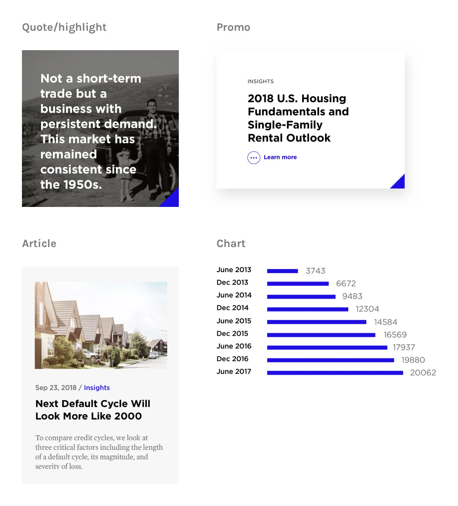
Reusable Components
We also developed a component library consists of elements that are repeatedly used through out the site.
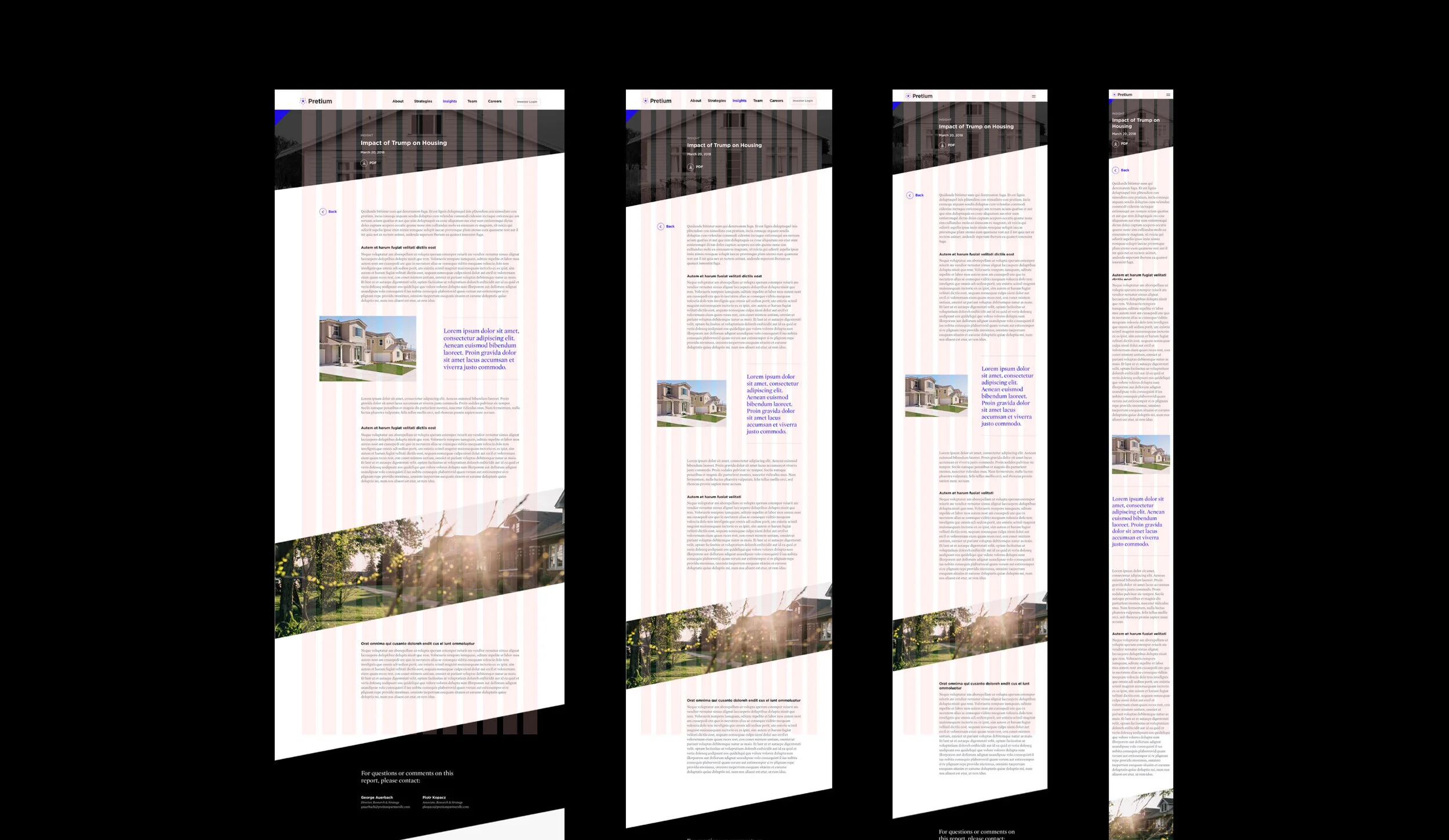
Responsive Grid
We developed a flexible grid system that will scale and change responsively. Starting from 12 columns, then becoming 8 and 4 columns when the viewport gets smaller. This will help the site perform well across different devices and screen sizes.
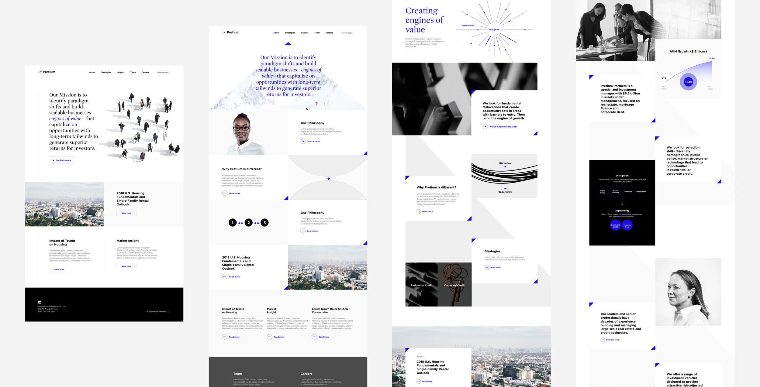
Initial Visual Explorations
We explored a couple different takes on the homepage as a starting point for the visual design. Color scheme, photography styles and graphics systems from the earlier branding exercise were applied here. We can see a strong brand expression coming together.
Photo and Video Assets
Photo and video shoots were held at Pretium’s headquarter to create imagery assets for the website. We also created a 3D ambient animation for homepage landing banner for a more dynamic experience. Art direction for the photos, videos and animations all follow the brand standards and help to push Pretium’s new brand expression even further.
Portrait photography: Sertaç Yildizhan
3D rendering and animation: Vincent Reynaud
Final Product
Pretium’s new website is clean, sophisticated and yet progressive. It tells the firm’s unique story and makes key information easily accesible to the user. While financial content tends to be dry and complicated, we were able to simplify the information structure and execute the visual design in a creative way which stands out from their competitors.
The website compliments their new brand guidelines and will serve as the strongest push of Pretium’s new brand image.
Reflection
The process of Pretium’s branding and website project is unique and exciting because we were fully involved in a new brand’s birth. Although it might seemed vague and overwhelming at the beginning, we were able to build a brand’s foundation step by step and eventually created an engaging digital experience using the foundation we built before. The client was also extremely happy about the results and has been using and promoting their new brand identity and website actively since launch.


